


October 5, 2017 –“Visually distinct” and “enduringly memorable” are often terms associated with coins. But in this case, it happens to be something directly associated with coins: the font used on the coin and in the printed materials for the 50th anniversary of the South African Krugerrand. The South Africa Mint announces it has won a Craft Award by the prestigious Loerie Awards for creativity in Africa and the Middle East. The award is in recognition of the successful reinforcement of the Krugerrand brand and its communication by developing the Krugerrand typeface in the lead up to the 50th anniversary celebration in 2017 of the world’s first bullion coin.
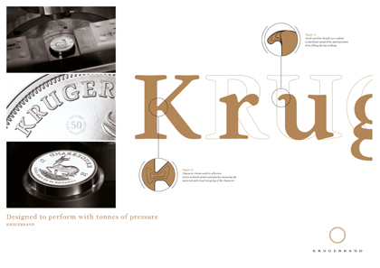
Information sheet on the Krugerrand font. Source: South Africa Mint.
Jan Erasmus, one of South Africa’s leading designers and educators, was asked by South African Mint to design a font family for the Krugerrand’s 50th anniversary. The special font would be used as of the 50th anniversary in 2017 for the coin, as well as the text face for all materials with respect to the Krugerrand. The Krugerrand typeface was specifically developed by Mr. Erasmus to be struck in 3-point font size into a coin blank under 150 tonnes of pressure.
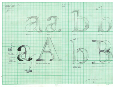
Erasmus’ original typeface. Source: South Africa Mint.
Erasmus developed the unique Krugerrand typeface by studying and re-cutting the original font used for the coin, the “Goudy Old Style.” Resulting in a medium contrast, with soft corners and straight edges to create a crisper typeface. The apertures of the new type face are more open to avoid the filling in of the individual letters by the flow of the metal during the Krugerrand coin striking process. The resulting letters are remarkably clear and distinct.
Jan’s goal is to develop custom fonts to be “visually distinct” and “enduringly memorable”, gaining his inspiration from the products and brands under consideration. The enduring value of the Krugerrand coin and brand is already 50 years old, and with its unique typeface is well placed for the future.
Jan Erasmus, born and raised in South Africa, was always interested in graphic arts and design as a young person. He studied graphic arts at the Johannesburg Technikon and continued his studies at the Philadelphia College of Art. Jan has worked for several agencies and eventually founded his own graphic design firm in 1990. In addition to being a full-service design studio, his company specializes in developing fonts for a variety of applications.
Further details can be obtained from the website of the South African Mint.
Here you can go to Jan Erasmus’ company CyberGraphics.
And a wealth of background information on the Krugerrand is available in the CoinsWeekly archive section.